Webdesign of an International Broker

Role: UI/UX Designer
Duration: 24 Months
Empoloyer: LYNX

Introduction

LYNX is a international introducing broker. Which serves 50.000+ clients as of the start of this project. LYNX offers services to her clients like trading in public companies and a educational and informational portal.

In the branding case (which can be found here) I talked about that adaptablity and inovation is key.

But also that LYNX operates in a fast moving market. Where every second counts for their clients. A fast performing website is key for them. A place where they can easily find all the information they need and get on with their trading day. Time is money as people like to say

Design System

Since one of the major reasons LYNX was in need of a new website was that there was a state of anything goes. To avoid limitless creation we created a design system.

Besides the lists of Vertical Rythem, font- and button stylings. The design system was created with the Atomic Design philosophy in mind. Where atoms become molecules, molecules become organisms and together create temmplates and pages.

Logo LYNX on brand

Component library

To support the design system we adopted a program called Abstract. Where we turned our molecules into organisms, what we call components. Abstract allowed the team to work together and iterate in one single source of truth.

During this period a extensive list of functionalities was set-up by different teams within the company. From which they thought they needed for the new website.

Logo LYNX on brand

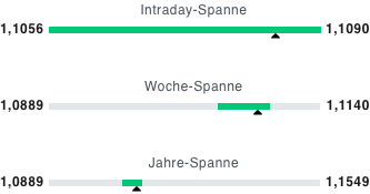
.RangeIndicator

Logo LYNX on brand

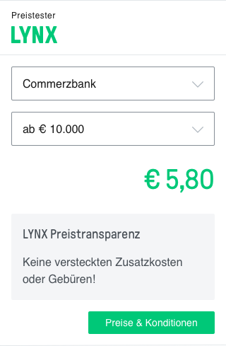
.PriceWidget

Logo LYNX on brand

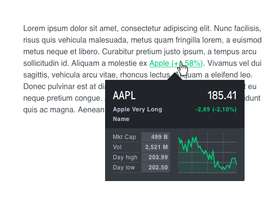
.PerformanceHover

Logo LYNX on brand

.Pagination

Logo LYNX on brand

.LogoTile

Logo LYNX on brand

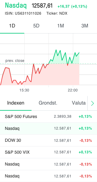
.IndexTile

The Brand guide

To re-emphasise the importance of consistancy, a public brand guide was created. Accesable for the whole company. This is where all the rules and vision is explained from a designers point of view.

A place where each employee can come to if they have initial questions about for example: logo downloads or color uses. But also how to build and structure pages, for the employees who build them. Or word / powerpoint templates for whoever needs them.

This brand guide free's up important time of a relativly small group of designers. To focus on more important work. Rather than answering the same question or sent the same files multiple times a week.

Small sample of the brand guide

Result

The result is a consistant brand over 9+ countries, where before each branch was slightly different from the other.

But also an website that is easily expandable, duplicatable and adaptable. A website where any person which is interested in the stock market, can find any information their trading heart desires.

Interested in working together?

Send me a email!

I don't bite 😉